USA
USA
 Canada


Photorealistic Tattoo Ink - Photorealistic Tattoo Ink
Filters
Products:
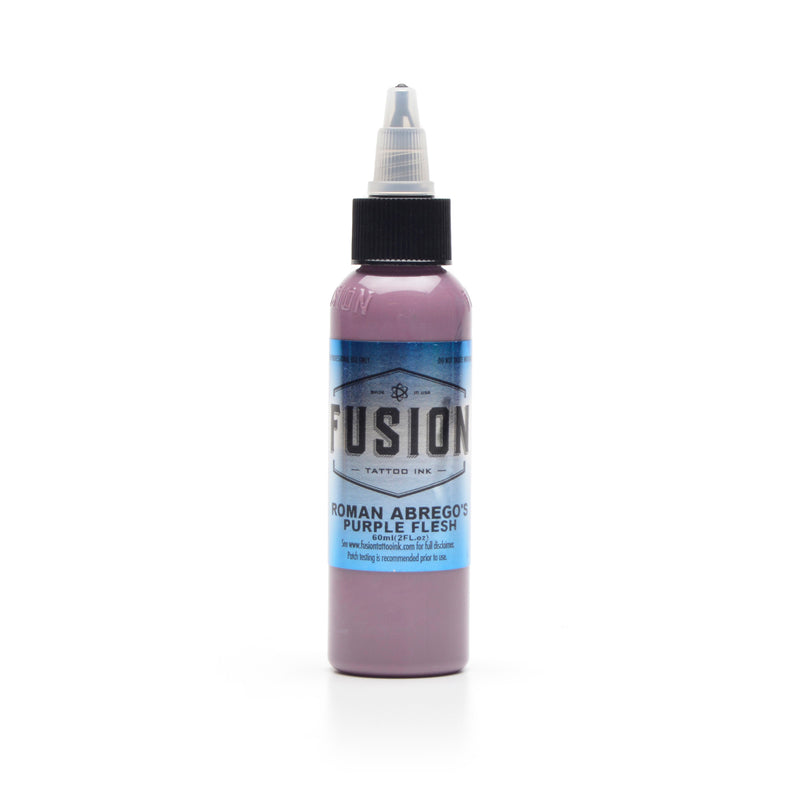
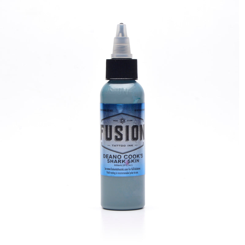
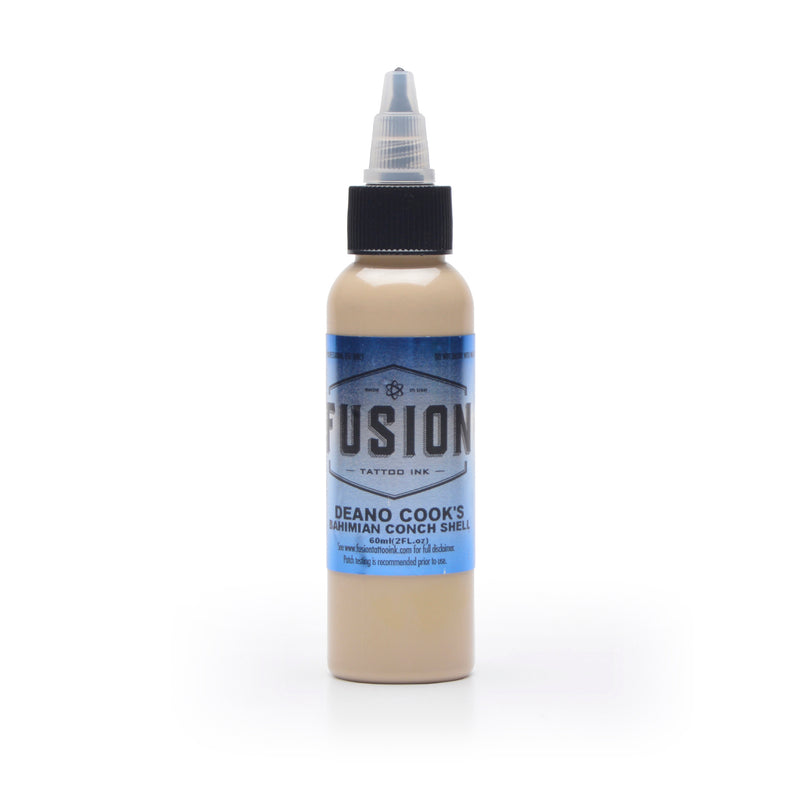
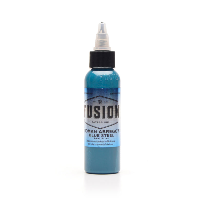
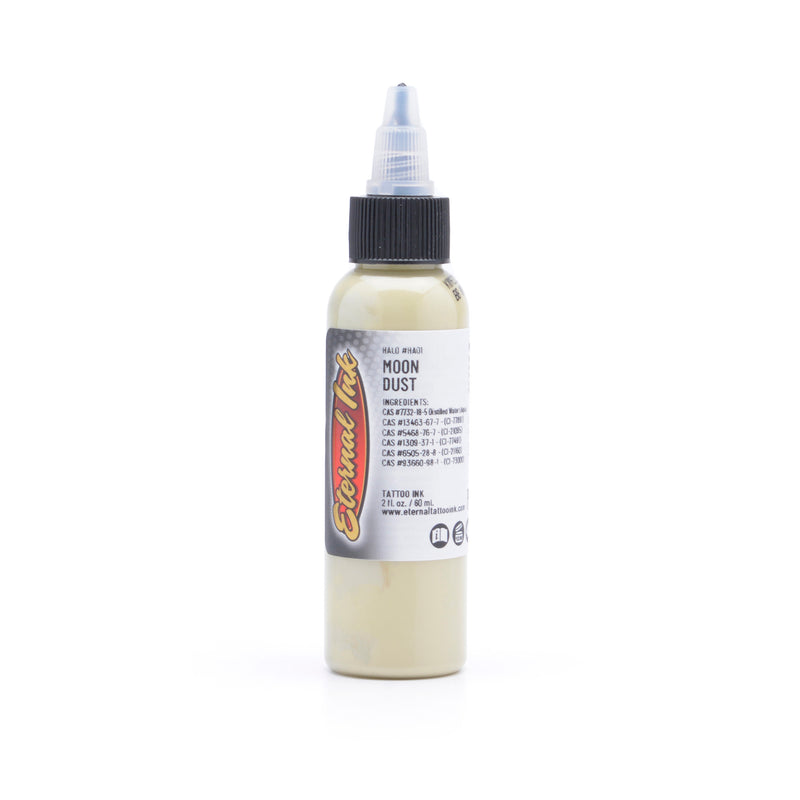
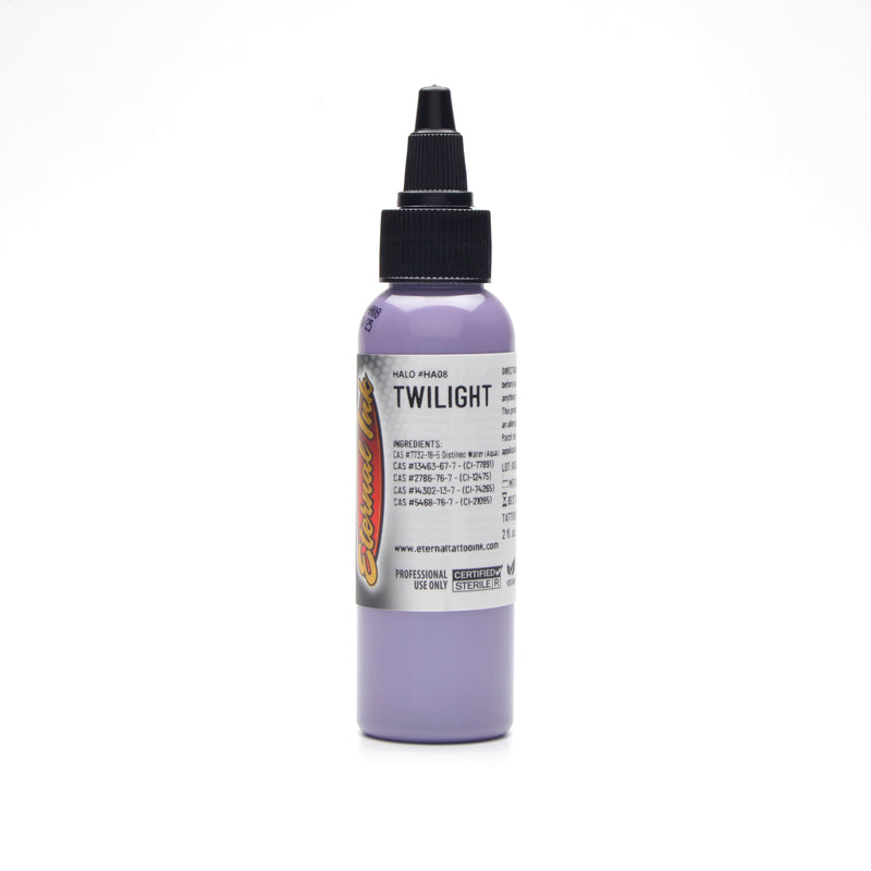
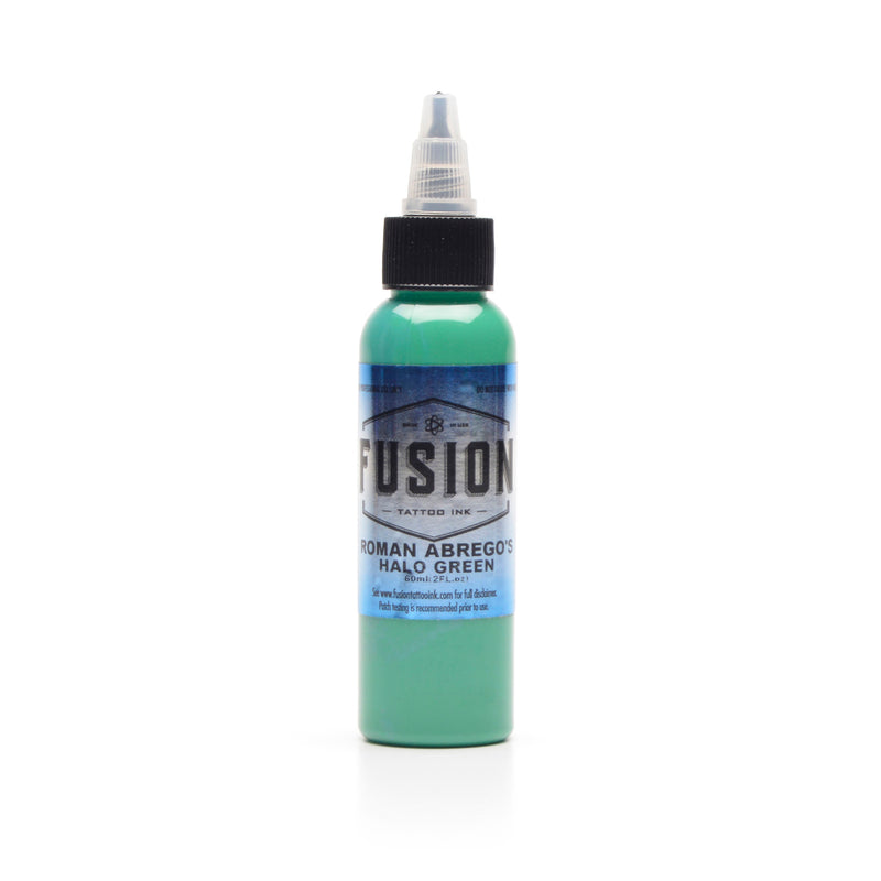
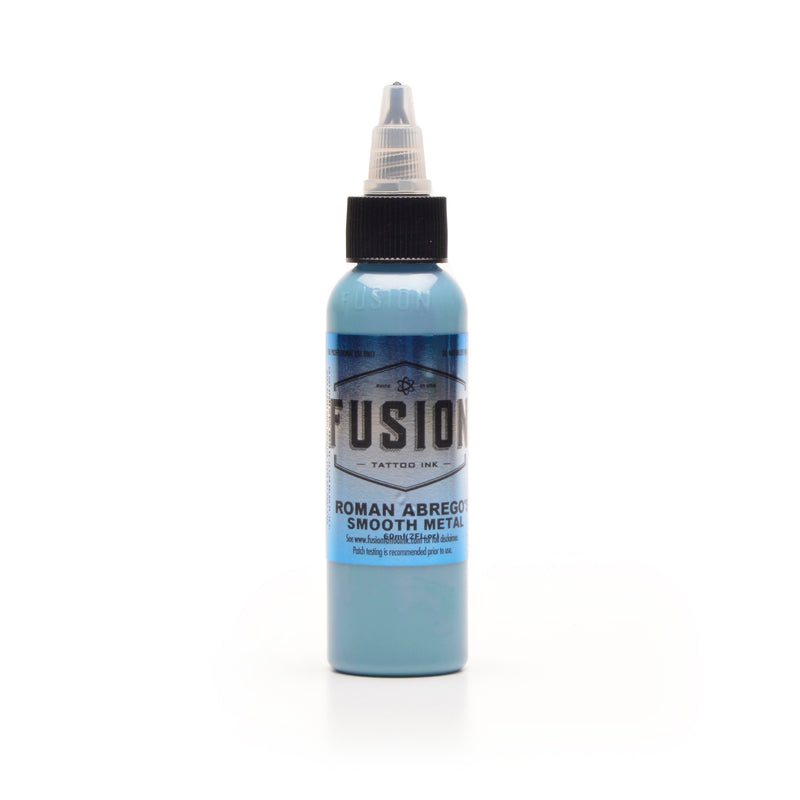
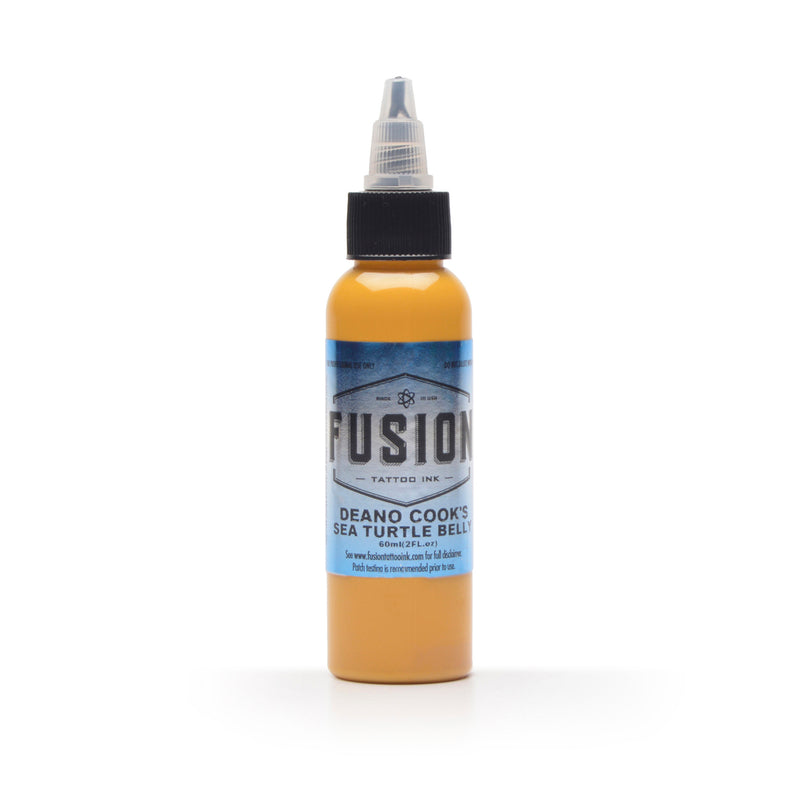
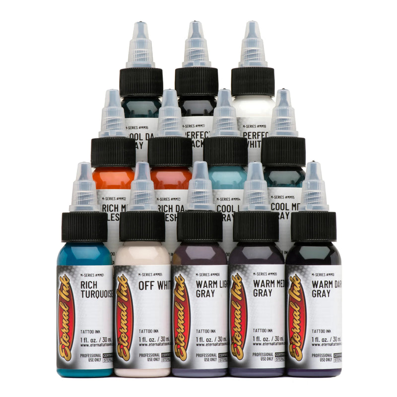
Photorealism Needs Value, Not Just Colour
A photograph reads because of its value range — how far it travels between its lightest and darkest point. Skin is a translucent, tinted layer over everything you put in it, and it flattens what sits underneath.
So contrast does more work than brightness. A colour stays legible when it has enough density behind it — which is why the ranges built for density matter as much to a value piece as to a colour one — and enough contrast around it to stay separate from the skin it lives in.
That contrast is built from the tonal half of the palette, which is bought separately from the colour realism range and behaves differently.
Greys for Shadow and Recession
Greys are how depth gets built — the tones that push a surface back rather than bring it forward.
They come in two forms and the difference is structural. A wash system is a coordinated set of graduated stages meant to be used together; a single bottle of "grey wash medium" is a wash, not a system. Empire's ramp is the most documented set we carry, running graywash, whitewash and blackwash as three distinct tools.
Which stage does what is a working judgment, and the ranges are built to make that judgment repeatable rather than to make it for you.
Why Isn't an Opaque Grey the Same as a Greywash?
Because they are built differently and they behave differently, and this is the distinction most worth getting right on this page.
Graywash is black in a clear carrier — transparent shadow grey. What is underneath still reads through it, which is exactly what you want for shadow.
An opaque grey hides what is under it. Empire's whitewash sits between the two — graywash with a small amount of white added, semi-opaque — and Empire's own guidance is that it goes in like a graywash and heals like an opaque grey. Blackwash is different again: higher pigment, no white, a tonal-dark gradient rather than a diluted grey.
Buying one expecting the other is the common error, and it shows up at the healed stage rather than on the day.
White as Highlight and as Mixing White
White does two unrelated jobs, and a range that is good at one is not automatically good at the other.
Highlight white goes in last and has to stay opaque against skin. Mixing white goes into other colours to cut them, and its job is to lighten predictably without dulling. Eternal describes its Halo Fifth Dimension line as opaque tints for energising dark and mid tones — the brand's own framing for a related job.
The honest caution: titanium dioxide, the pigment behind most whites and pastels, tends to yellow as it ages. A highlight is the part of a piece most likely to shift.
Browns and Neutrals for Skin and Natural Surfaces
Browns are the bridge between value work and colour. They carry natural surfaces — wood, hair, fur, stone — and they are also where photorealism meets portraiture.
Where the subject is a face, the tonal range you need is a dedicated one: the skin and flesh tone ranges are built as graduated steps and named palettes rather than as general browns, and they behave differently at low opacity.
For everything else, the neutrals in a signature palette usually do the work — which is a question of building a palette rather than of any single bottle.
Buying Photorealism Ink in Canada
Greys, whites and colour all ship from Kingston, Ontario, like the rest of the ink range. Ordering needs a verified Pro Account — Eikon sells ink to working artists only, which is trade access rather than a price tier.
Each is sealed individually so a leak in transit costs one bottle rather than the order, and heat packs are free from November through March.
Sizes vary by line; each product page lists what it comes in. Every brand here is notified with Health Canada, the legal condition for selling ink in this country.