USA
USA
 Canada


Colour Realism Artist Favourites - Colour Realism Artist Favourites
Filters
Products:
What to Look For in Colour Tattoo Ink
There is no single best colour tattoo ink. What working colourists compare comes down to four things.
Pigment load. More pigment means the colour goes in with fewer passes. It is also the property most often confused with brightness — a thin, vivid-looking colour in the cap can go in weaker than a dense one that looks flat in the bottle.
Hue accuracy — the one artists track hardest across a catalogue. A red that runs orange or a green that pulls yellow is not a defect so much as a characteristic, but it changes which colour you pick up and what you mix it with. Most artists learn a range's quirks and buy around them.
Range and mixing logic. A colour range that covers the wheel and mixes predictably against itself lets you build a palette instead of assembling one. That is a different question from how many colours a brand makes — a broad catalogue with no internal logic is harder to work than a smaller one built to blend.
How it handles — usually what decides whether you keep buying a line. Colour inks sit at different body weights: a thinner, medium-bodied colour moves easily and suits blending and soft transitions, while a denser one stays where you put it, which is what you want when you're packing colour. Neither is better; they are answers to different jobs, and most artists end up with both on the station.
The rest of it shows up in the small things over a long session — whether a colour wipes cleanly, how readily it starts drying in the cap, and how much it settles between uses, pigment and carrier separating in the bottle.
No brand we carry publishes a viscosity figure, so body weight is artist-reported rather than a specification — worth testing on your own setup rather than taking from a description.
The Colour Brands Eikon Carries
Four of the seven lines Eikon carries are built around colour, and each one is strong at something different.
Eternal — the range you mix from
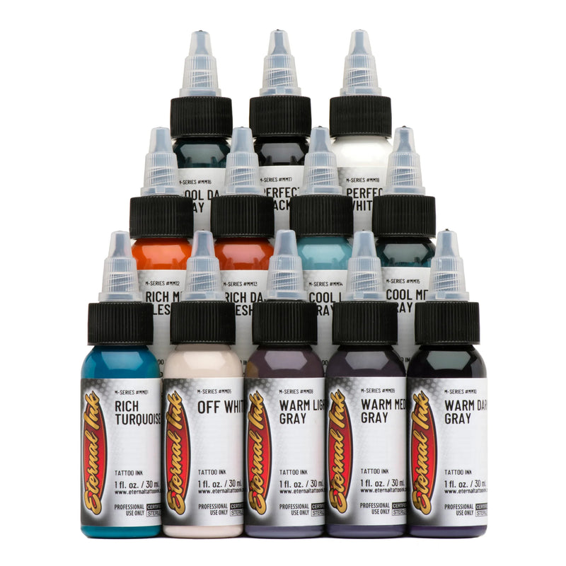
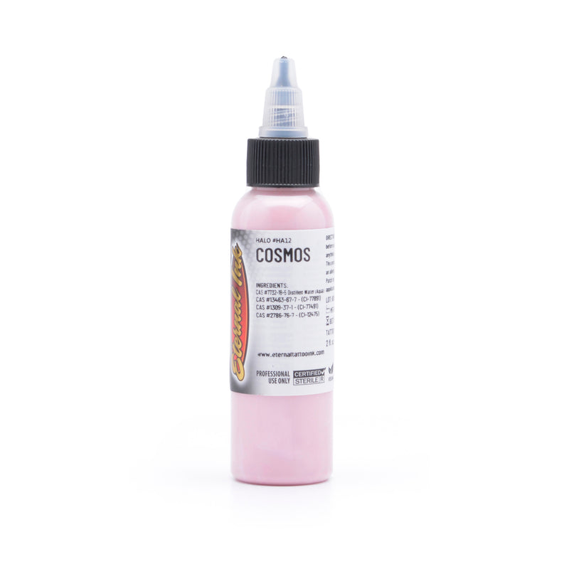
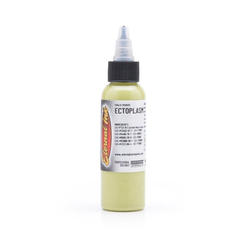
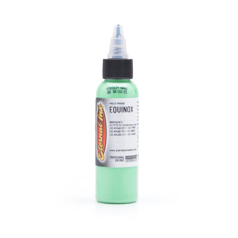
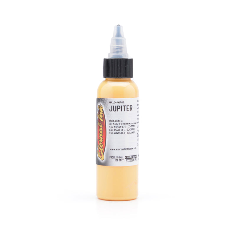
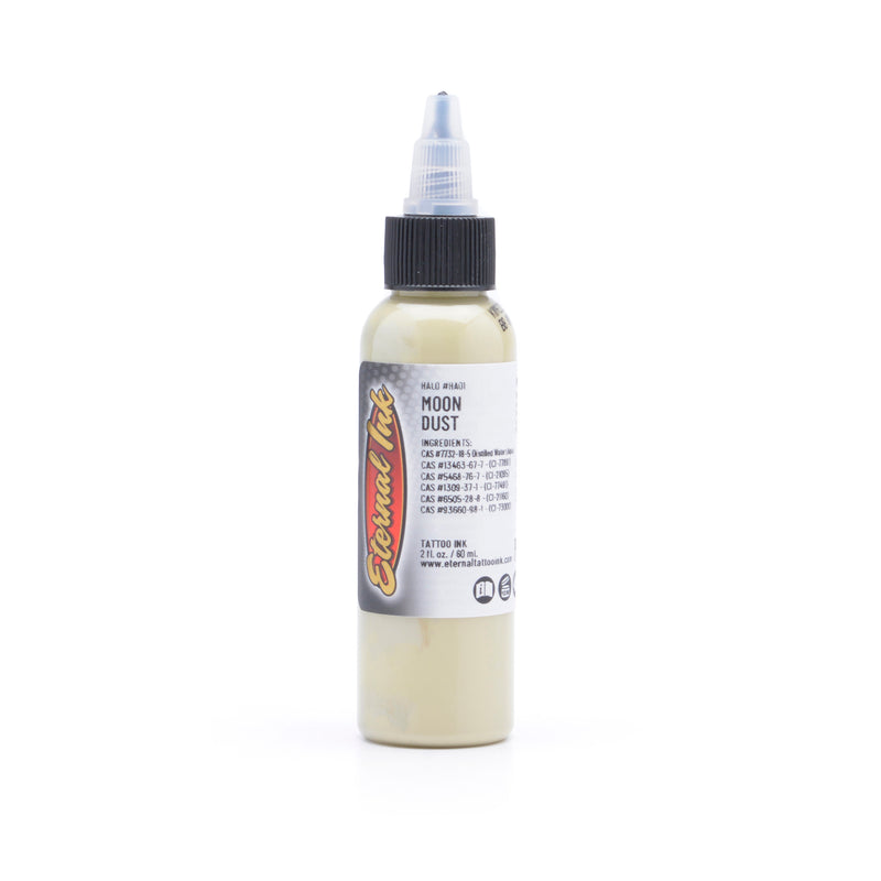
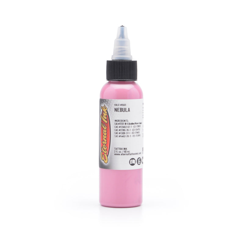
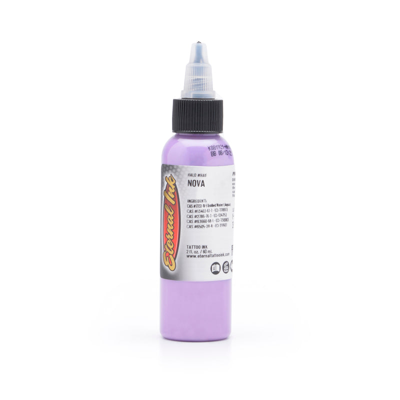
Eternal is the broadest colour catalogue here: Eternal counts 300+ colours across roughly 27 lines, and it publishes pigment CI numbers on its product pages — the most detailed pigment disclosure of any line we carry. Eternal's Color Wheel System, spearheaded by Liz Cook, is the mixing logic behind it; her 12-colour signature set is that system in a smaller, buyable form.
Underneath the signature sets sits the Standard line — 67 core colours, most of which we stock as singles. For a colour-heavy practice, it is the line you can standardise on without switching brands partway through a piece.
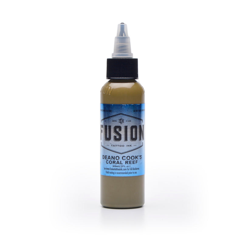
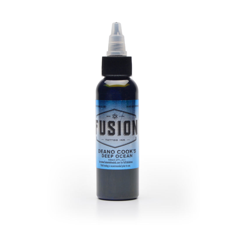
Fusion — tonal steps already made
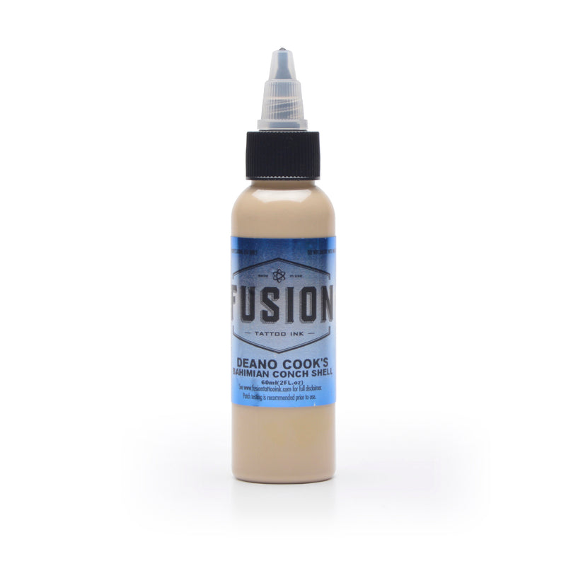
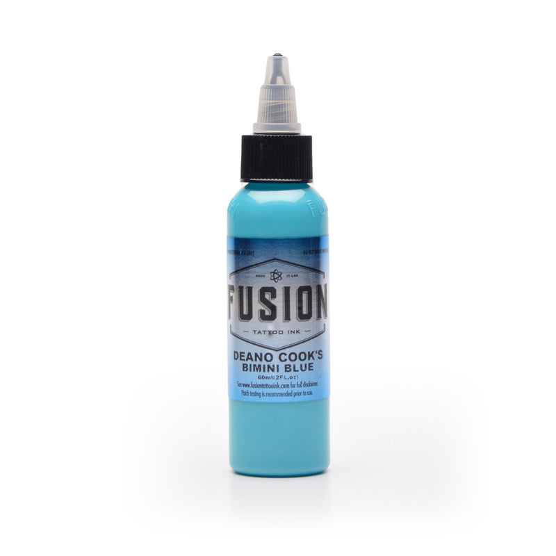
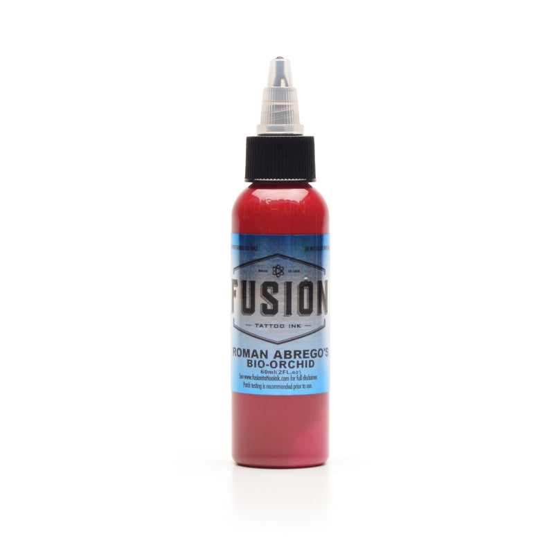
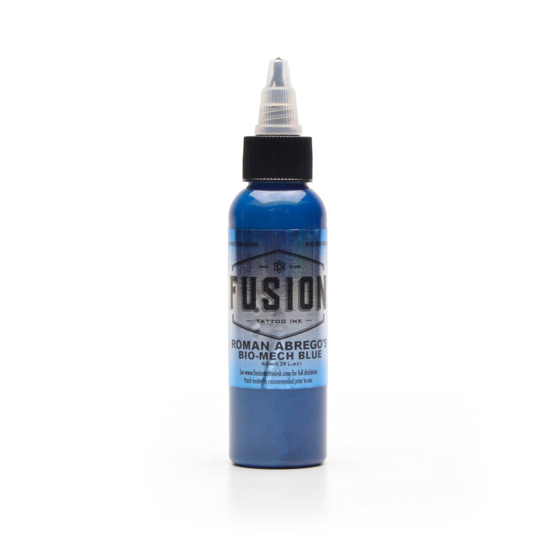
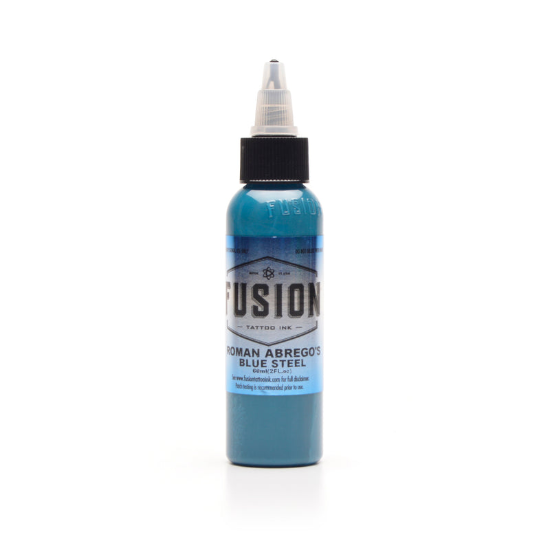
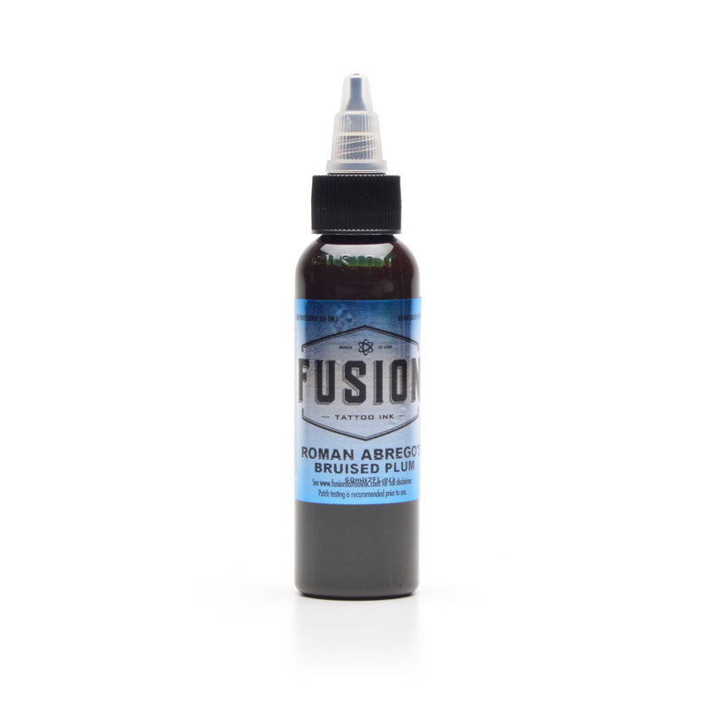
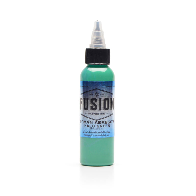
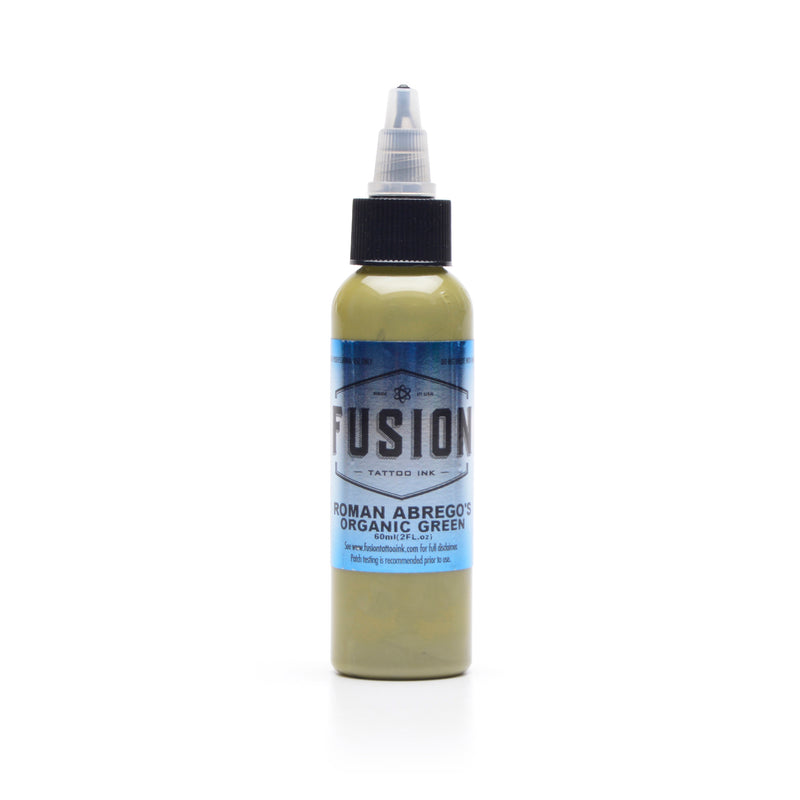
Fusion is built around one idea. Its Gradient System ships its base colour families in graded cuts — most in four, stepping from full-strength pigment down toward white — so the tonal steps come pre-mixed instead of being mixed in the cap each time. Eleven base families cover the working spectrum. It is the only line here that takes in-cap value mixing out of the default workflow, and it is why Fusion turns up so often in colour realism work. The Power colours sit at the other end — uncut, maximum pigment, made for packing.
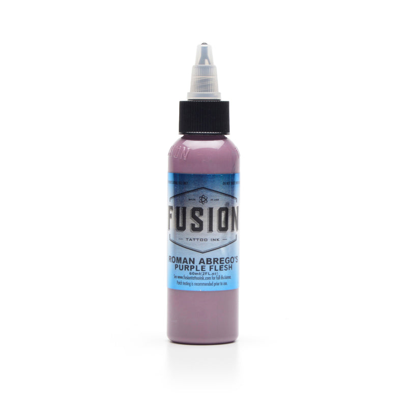
Fusion also runs a dedicated five-colour flesh tone set, Extra Light through Extra Dark, which is where a lot of complexion and portrait work starts before it gets extended with signature colours.
Solid — the artist palettes
Solid is built on powder pigments rather than pre-dispersed pigment, which is the disclosed driver behind the saturation it is known for. Its strength is the signature range: working palettes built by named artists — Horitomo's Japanese-traditional set, Ami James's fundamentals set, and Max Rodriguez's tropical colours by the bottle — each built for a particular kind of work. Solid also publishes its full carrier, which is unusual.
Dermaglo — dense colour for packing
Dermaglo colours are the ones artists reorder by name — Canary Yellow, Navel Orange, Bubblegum Pink, Lunar Green. It runs dense and heavily pigmented, which is what you want for packing colour over a large area, and in 2024 it added four new colours, its first in a decade — Deep Crimson Red (richer and darker than the old Dark Red), True Love Red, Ocean Blue and Aqua Foam. The formulas have held for more than two decades, so a colour you dialled in years ago behaves the same today.
The one technical claim Dermaglo makes for itself is micro-dispersion, its own term for how finely the pigment is worked through the carrier; the brand leads on that process rather than publishing pigment chemistry.
The other three lines we carry are built for black and grey rather than colour — see the black and grey range.
Sets, Singles, and Mixing Your Own
Most working artists end up with all three, and the choice is about palette logic rather than what arrives in the box.
A set earns its place when the colours are calibrated against each other. Fusion's Gradient System is the clearest case: the value steps are pre-engineered, so a tonal transition is a matter of pulling the right cut rather than rebuilding a ratio mid-session. A signature set works the same way from a different direction: one artist's working palette, ready to run.
Size matters here too — a small sample set is a cheap way to find out how a range behaves on your setup before you commit to it, while a full standard set is something you pull from and top up over years.
Singles are how you keep the colours you burn through in stock, and how you build a palette shaped to your own work rather than someone else's. If you have been at it a while, you already know which three or four you reorder. The colours that empty first are rarely the unusual ones — it tends to be the workhorses that carry most of the piece.
Mixing your own depends on the range more than the technique. Eternal's Color Wheel System exists precisely so its colours blend predictably against one another instead of fighting. Solid makes a dedicated Mixing Solution for thinning. Fusion's Mixing-prefixed colours are formulated to go into other colours rather than stand alone.
Can you mix colours to make new ones? Yes, and most artists do — the question is whether the range you're mixing was built for it.
Why Do Some Colours Fade Faster Than Others?
How a colour ages depends more on the pigment family it's built on than on the brand on the bottle. Reds built on naphthol pigments are among the more UV-sensitive, and the immune system carries some of it off over time — they tend to soften toward a dull pink. Blues are more likely to shift than fade: as the layer thins, warmer skin undertones start reading through, and the blue can drift green. Yellows and oranges absorb more UV than most of the palette, so they usually wash out first — and more so with no black structure around them holding the edge. Titanium dioxide, the white behind most pastels, tends to yellow as it ages.
None of this runs on a clock: placement, sun exposure and skin do as much work as the pigment, and plenty of colour holds far longer than the pattern suggests.
How Does Skin Affect the Colour You See?
You never see the colour on its own. It sits in the dermis under a translucent layer of skin, and that layer is part of what you end up looking at — which is why the same colour out of the same bottle looks like two different colours on two different clients.
That layer does not stay constant either. As a colour thins over the years, the tone underneath starts reading through it rather than being masked by it. The clearest instance is a blue drifting green: the blue has not turned, but the warmer undertones beneath it are now contributing to what reaches the eye.
The practical consequence is that contrast does more work than brightness. A colour stays legible when it has enough density behind it, and enough contrast around it, to stay separate from the skin it sits in; a bright colour put in thin has less holding it apart. Which colours suit which client is a judgment made in the room, on the skin in front of you — not something a catalogue can answer.
Buying Colour Tattoo Ink in Canada
Colour ships coast to coast from Kingston, Ontario, and sells to working artists only — ordering needs a verified Pro Account, which is about trade access rather than price.
Each colour goes out individually sealed, so a leak in transit costs one colour instead of the order. Heat packs are free from November through March.
Sizes vary by line; each product page lists what a colour is manufactured in. Every brand on this page is notified with Health Canada, which is what makes it legal to sell here.